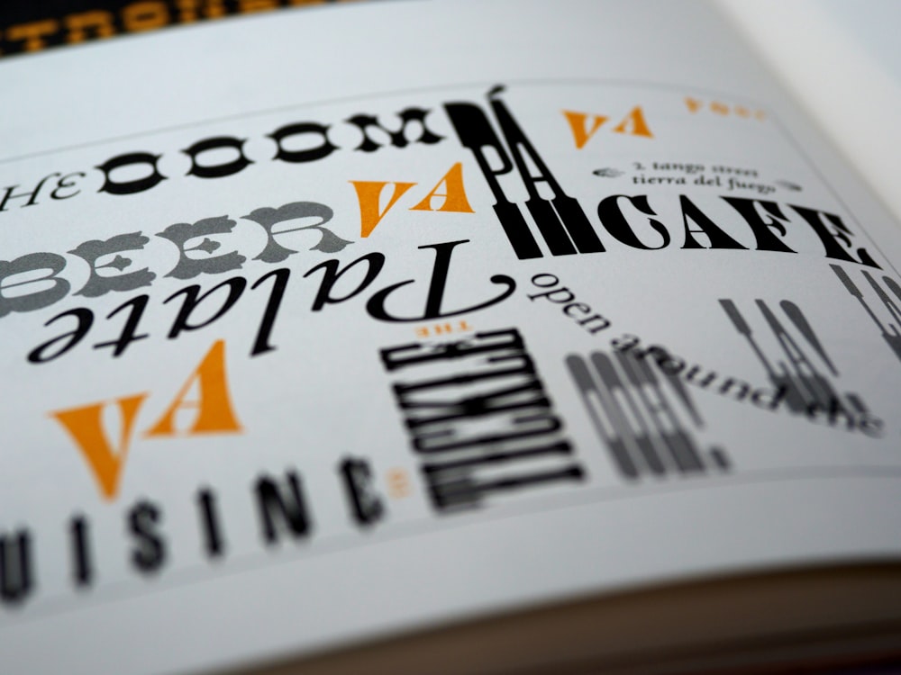
In the vast landscape of branding, where first impressions matter more than ever, businesses are constantly seeking innovative ways to stand out. In this pursuit, the power of visual elements cannot be overstated. Fonts, often overlooked, possess the power to evoke specific emotions, differentiate a brand in a crowded market, and resonate with target audiences.
By exploring the nuances of different font styles, businesses can elevate their branding strategy, creating a lasting and memorable connection with consumers. In this blog post, we unravel the significance of using different fonts to establish a visual identity that stands out in the competitive landscape.
The Role of Fonts in Branding
Consistent brand presentation across all platforms, as revealed by a study, has the potential to boost revenue by up to 23%. One of the components that play an important role in maintaining a unified brand presence is fonts.
They act as visual communication channels to convey their essence to an audience. Imagine a world where every brand used the same generic font—a monotonous and unremarkable visual landscape. Different fonts provide the opportunity for businesses to differentiate themselves, leaving a lasting imprint on the minds of consumers.
Creating a Visual Personality
In the art of branding, font selection is akin to choosing the right words—they serve as the visual voice of a brand’s personality. Whether it’s the graceful curves of a script font, the bold statements of a sans-serif, or the timeless charm of a serif font, each type carries its nuances, evoking specific emotions. For example, a luxury brand may opt for a sleek serif font, radiating sophistication, while a tech startup, aiming for innovation, might lean towards a clean sans-serif.
In the dynamic landscape of social media, particularly platforms like Instagram, font choices play a pivotal role. With fleeting attention spans, standing out is crucial. Brands can utilize Instagram font generators to ensure a consistent visual identity, adapting their fonts to the platform’s dynamic nature. Understanding how to use an Instagram font generator becomes a valuable skill, empowering brands to leave a lasting impression on their audience amidst the scrolling chaos. Ultimately, in the visual symphony of branding, fonts are the notes that resonate long after the melody fades.
Diversifying Fonts for Versatility
Establishing a distinctive visual identity doesn’t mean sticking to just one font. In fact, many successful brands leverage a combination of fonts to enhance versatility. Pairing a bold headline font with a complementary, easy-to-read body font can create a harmonious balance that captures attention and maintains readability.
Consider the iconic combination of Helvetica for headlines and Arial for body text, as seen in many renowned publications. The interplay of different fonts adds depth to the visual narrative, guiding the audience through the brand’s messaging dynamically and engagingly.
Expressing Brand Values
Fonts go beyond mere aesthetics; they serve as a visual portrayal of the principles and ideals that define a brand. Serif fonts, with their classic and traditional feel, may convey a sense of reliability and heritage. On the other hand, a quirky and unconventional display font can signal a brand’s innovative and daring spirit.
Take the example of the fashion brand “Kate Spade.” The playful yet sophisticated script font used in their logo perfectly aligns with the brand’s identity—stylish, modern, and a touch of whimsy. This visual consistency reinforces the brand’s values and creates a memorable association for consumers.
Standing Out in a Crowded Market
In today’s oversaturated market, standing out is imperative for success. Fonts offer a unique opportunity to break through the noise and capture the audience’s attention. By choosing a font that reflects the brand’s essence, businesses can distinguish themselves from competitors and make a lasting impression.
Take, for instance, the iconic case of “Coca-Cola,” whose distinctive script logo has become synonymous with the brand. The elaborate, flowing letters not only convey a sense of tradition but also stand out prominently on shelves and advertisements, making the brand instantly recognizable and etching its identity deeply into the collective consumer consciousness.
The Evolving Nature of Fonts
As design trends evolve, so do the preferences for fonts. Staying attuned to these shifts is crucial for maintaining a contemporary and relevant visual identity. Brands need to periodically reassess their font choices to ensure they align with current design sensibilities and resonate with their target audience.
For example, the resurgence of retro and vintage aesthetics has seen many brands embracing classic serif fonts with a modern twist. This blend of old and new creates a visually appealing and nostalgic connection with consumers.
Final Thoughts
In the intricate tapestry of branding, fonts emerge as unsung heroes, silently influencing perceptions and establishing a brand’s distinctive visual identity. The artful selection and combination of fonts can elevate a brand, making it memorable, relatable, and relevant in the eyes of consumers.
As businesses navigate the competitive landscape, understanding the nuances of fonts becomes a strategic imperative. Fonts offer brands an incredible opportunity to tell a compelling narrative, showcase their distinct personality, and leave an indelible mark in consumers’ minds. When it comes to branding, success lies in the details—fonts serve as brushstrokes to paint an identity onto consumer consciousness.

